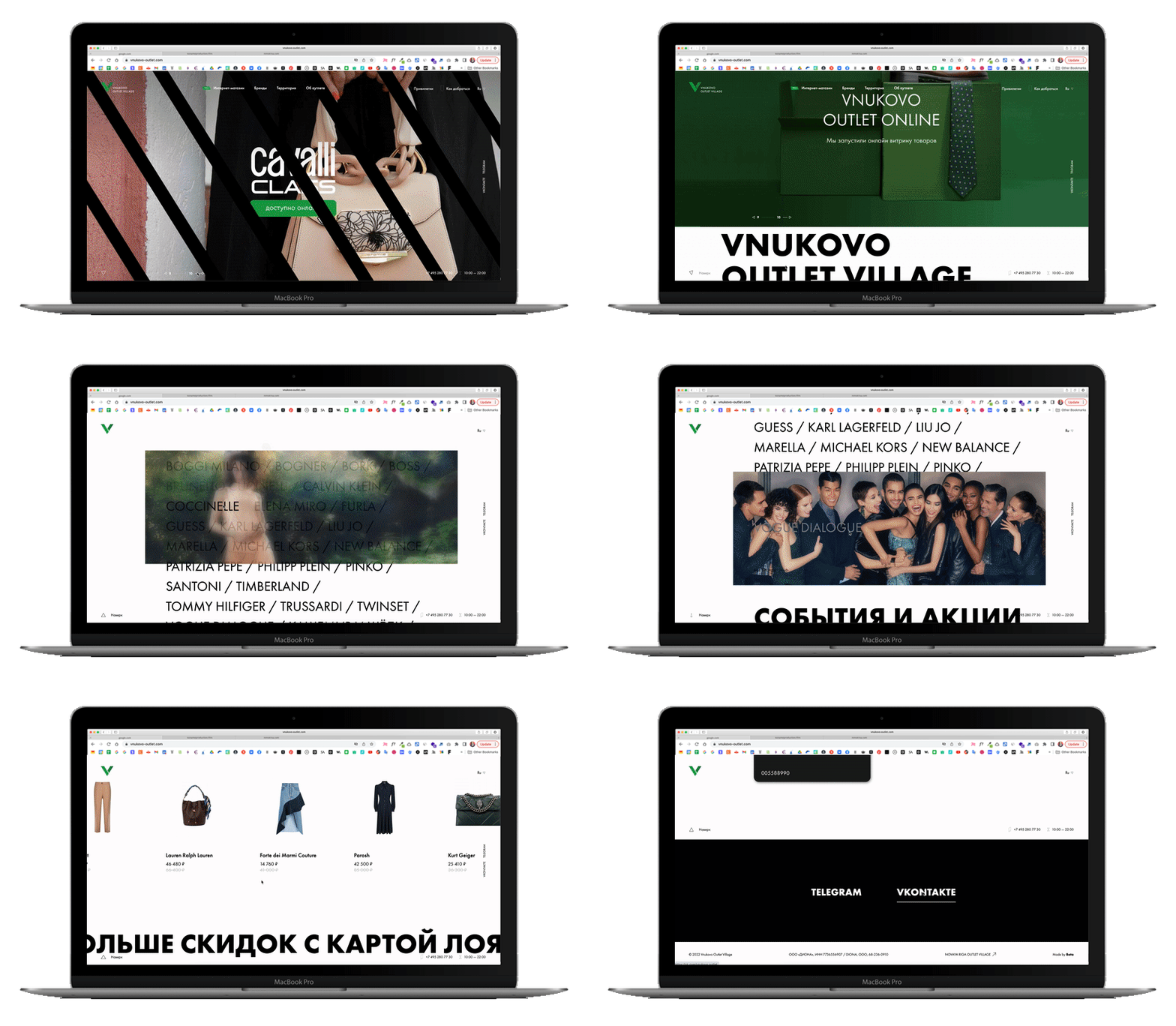
Vnukovo Outlet
logo design / branding / web design / branded merchandise / packaging
Client: vnukovo-outlet.com
Team: Beta Agency
Client: vnukovo-outlet.com
Team: Beta Agency
The task was to upgrade visual concept with saving the current colour set (green and black) and "V" letter as a graphic element of the logo.
Brand refresh involved updating all existing copies of the logo, printing materials, the website, facades, wayfinding system, promo, billboard and online commercials etc.
Brand refresh involved updating all existing copies of the logo, printing materials, the website, facades, wayfinding system, promo, billboard and online commercials etc.
Famous brands with discounts
By 2018, VOV decided to update its identity as the old one was outdated, and all its branded content and materials were not meeting the standards of the modern image, giving the wrong message to the customers.
Vnukovo Outlet Village is one of the first and largest outlets in Russia. There are boutiques of world-famous brands with discounts of up to 70% on the collections of past seasons.

vertical version
vertical version


It is recommended to avoid placing text diagonally that is not aligned to the left or right (especially if there are more than 2-3 lines).
In general use cases, the slope of the plate should not be reflected horizontally, with some exceptions.
Using a lot of “stripes” on one layout is not recommended, as there should be no more than 2-3, depending on the needs of marketing activities.
It is not allowed to break the plate in the layout in height from above or below if it does not go beyond the boundaries of the layout.
The recommended width of the plate on the layout depends on the required content placed on the layout, but it should be approximately no more than 75% and no less than 25% of the total area of the layout.
The shape of the die is strictly used at an angle of 122°.
The angle cannot be changed up or down.
The angle cannot be changed up or down.


Main approaches
for using graphic elements
for using graphic elements
Branded paper bag
Plastic club card with an envelope
Personal business card / letterpress, blind print of the brand sign “V”, coloured edges
Corporate business card / premium silk paper 350 gsm
Seasonal catalogue of special offers
Example of a branded card for special offers
/ brand identity
/ 3D ILLUSTRATIONS
/ art direction & creative team management / rebranding / website design
/ editorial
/ brand identity & pOSM
/ brand identity & POSm
Item 8
Clothing Brand
Clothing Brand
brand identity / web design & social nets / support
COMING SOON
Dedu Adult Learning
/ brand identity, POSM & Packaging
COMING SOON
brand identity / web design & social nets / support
COMING SOON
/ brand identity, POSM & web design
/ other projects
/ co-ownership, cover & layout design, articles, styling photoshoots, management, prepress


